I’ve been creating some short screencasts to help a friend transition from Windows to a new Chromebook. This includes some iOS apps. As I get ready to show him the Google Calendar app, I’m reminded of the calendar I saw on his refrigerator. It’s the “family calendar” where everyone keeps up with who’s where.

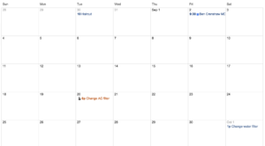
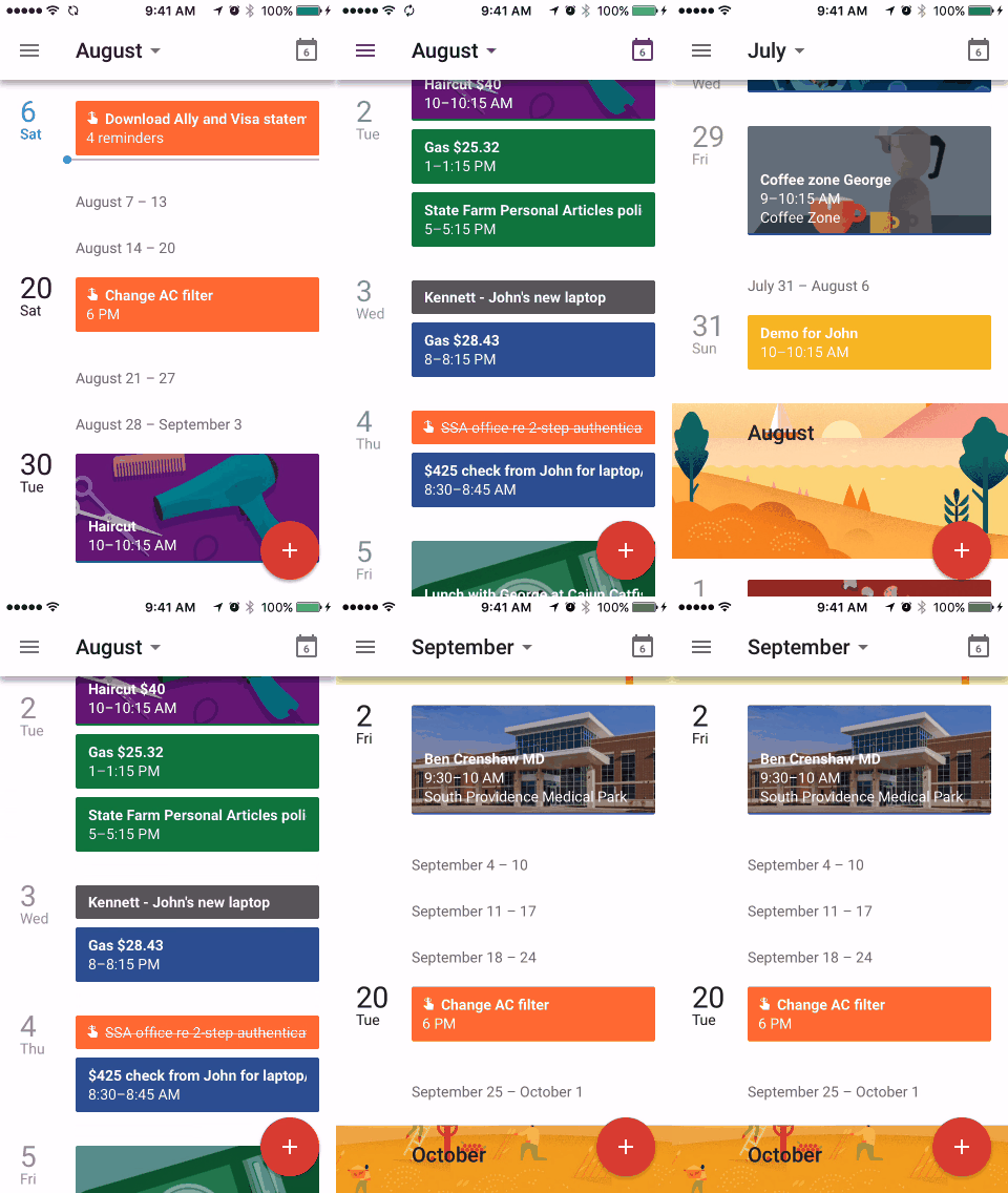
This got me thinking about the seven columns/four rows layout of calendars. I always took this for granted until I started using the “schedule” view in Google’s iOS app (see GIF below). This linear, flowing presentation makes perfect sense on a smart phone where you can endlessly scroll (or search). And the 7-by-4 layout of paper calendars don’t work as well on smaller screen.

The 7-by-4 layout makes sense if your calendar is printed on a sheet of paper (as it has been for hundreds of years). And if we’re going to share the calendar, we have to be looking at the same piece of paper. Not so in a cloud-connect, smart phone world.
In front of my laptop, I still opt for the month view in Google Calendar but I’ve gotten used to the schedule view on my phone. Will the 7-by-4 view be with us always or will it become a quaint anachronism for those who never knew anything but smart phones?


