Irresistible.
Category Archives: Gadgets & Apps
twitcam
Streaming live video has never been easier. Ironically, the bigger challenge is coming up with something anyone would care to watch. Which I clearly demonstrated this morning at the Coffee Zone.
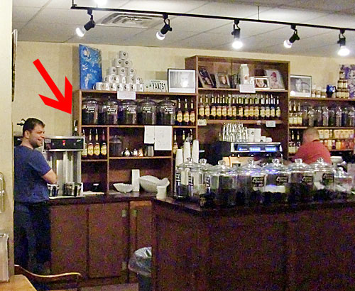
In the photo above, you can see my BT-1 wireless webcam atop the Rocket Fuel storage tank. I was sitting about 25 feet away and never lost the signal.
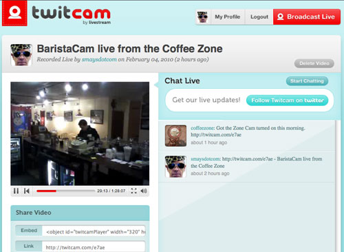
Instead of uStream or qik (which works with mobile phones only, as far as I can tell), I used a nifty site called TwitCam. The screenshot below is really all there is to twitcam. And, yes, it’s free. For now. You just log in with your Twitter info and go. TwitCam records as it streams. No option for live stream only, as far as I could determine. I don’t see how video can get much easier than this.
As soon as I can come up with something worth the bandwidth, I’ll take this back to the state capitol.
The art of the tweet
From a thoughtful –and useful– post by Tammy Erickson (@tammyerickson) on how to make Twitter fun for your followers:
- Don’t report banal details. Unless you’re observing a true breaking news event (and note: this term does not include what you or your child ate for lunch), skip it.
- Do interpret your experiences. How do they make you feel? What do they mean to you?
- Do share the oddities you observe. Look for things that seem unusual, out-of-place, surprising.
- Do share things you love – quotes, phrases, descriptions of events that brought joy to your day.
Her conclusion:
“Slow down, enjoy. Listen to the world’s music. Share the best of your experiences, but remember, 140 characters is a unique format — more like poetry or Haiku than news reporting.”
Stephen Fry on the iPad
British wit and tech daddy-o, Stephen Fry, on the iPad (just a couple of snippits from lengthy but excellent review):
“Newspapers, magazines, literature, academic text books, brochures, fliers and pamphlets are going to be transformed (poor Kindle). Specific dedicated apps and enhancements will amaze us. You will see characters in movies use the iPad. Jack Bauer will want to return for another season of 24 just so he can download schematics and track vehicles on it. Bond will have one. Jason Bourne will have one. Some character, in a Tron like way, might even be trapped in one.”
“How much easier it is to distrust, to doubt, to fold the arms and say “Not impressed”. I’m not advocating dumb gullibility, but it is has always amused me that those who instinctively dislike Apple for being apparently cool, trendy, design fixated and so on are the ones who are actually so damned cool and so damned sensitive to stylistic nuance that they can’t bear to celebrate or recognise obvious class, beauty and desire. The fact is that Apple users like me are the uncoolest people on earth: we salivate, dribble, coo, sigh, grin and bubble with delight.”
Ahem. I confess to all but the dribble. I try not to dribble.
From my lips to WordPress
One of the reasons that most folks don’t blog from their iPhone or mobile device, has to be the difficulty of typing a paragraph or two. With Dragon dictation, it would seem that I could simply dictate a post and paste that into the rather handy WordPress iPhone app.
Back to Google Reader Shared items
On several occasions I have gushed about Posterous, the life-streaming/blogging tool. I used it for most of the past year but put it aside a couple of days ago. At least for my personal use. Several of our company blogs are using posterous.
I had to stop for sort of a silly reason. I kept sending personal stuff to one of the company blogs. Not good. The only sure way to avoid this was to pull the plug on the personal account.
I like having a place I can quickly share something of interest and it was there all the time, in Google Reader. For me it does all that I liked about posterous (with a few bonus features). Latest links are back in the sidebar.
AP Mobile
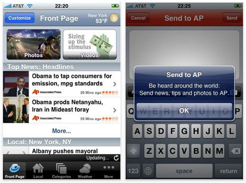
During my “on air” days (the ‘70s and early ‘80s), the AP teletype was our station’s connection to the world. During the late 80’s and early 90’s, I spent a good bit of time trying to create a low-cost alternative (mostly for radio stations) to the AP’s wire service. This morning I downloaded AP Mobile to my iPhone.
I have a feeling it will become my default app for news. Text, photos, video… it’s all there. I can flag topics of interest and AP Mobile will “push” those to me. And if I see a story and want to “report” it to AP, the app makes it easy.
Associated Press used to be pretty protective of it’s stories. Perhaps they still are, I would have no way of knowing. The old radio guy in me can’t help thinking of this is a tiny version of the old teletype. And my next thought is, “How could the AP police all of the broadcasters and keep them from using AP stories without paying for it?”
The answer is, I’m afraid, they don’t care. Would I rather have the full-featured, on-demand experience offered by AP Mobile… or hear my local “announcer” read it to me?
Augmented reality and the annotated world
The following is from a post by Jeff Jarvis in which he talks about augmented reality and the annotated world and the ever-changing definition of journalism and local news.
“Every address, every building, every business has a story to tell. Visualize your world that way: Look at a restaurant and think about all the data that already swirls around it — its menu, its reviews and ratings and tags (descriptive words), its recipes, its ingredients, its suppliers (and how far away they are, if you care about that sort of thing), its reservation openings, who has been there (according to social applications), who do we know who has been there, its health-department reports, its credit-card data (in aggregate, of course), pictures of its interior, pictures of its food, its wine list, the history of the location, its decibel rating, its news…
And then think how we can annotate that with our own reviews, ratings, photos, videos, social-app check-ins and relationships, news, discussion, calendar entries, orders…. The same can be said of objects, brands — and people.”
His post includes a few videos but this is my favorite:
When I think about the implications of this technology, and what it means for news organizations, I have what I have come to think of as Wile E. Coyote moments. The realization most will never catch the Road Runner (Beep, Beep!) The future –which is here– belongs to small, flightless birds that refuse to play by our cartoon rules.
PS: If you’re satisfied seeing the world through emails and text messages, your BlackBerry will be fine. If you want to augment your reality (and you will), it will be with an iPhone or similar device.
Google Living Stories
flickr interestingness
UPDATE 5/27/19: Looks like these features are no longer available.
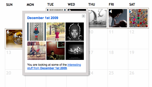
Flickr has something called “interestingness.” I don’t know if this is new or I just never noticed. A photo gets included based on “where the click-throughs are coming from; who comments on it and when; who marks it as a favorite; its tags” and other stuff. You can spend hours on interestingness so don’t go unless you have some time.
Not sure why, but there’s a calendar view in case you wanted to see interesting photos from June, 2008, for example.

