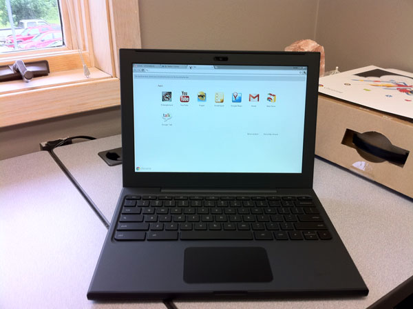
I was certain I had posted something about Google sending me a Chrome Notebook to try out but I can’t seem to find it [will update later]. After playing with it for a week I handed it off to George Kopp who kept it for a week and then last Saturday, Tom Piper took it. His excellent comments below.
Disclaimer: The first most difficult task is to set aside 32 years of self-contained computer experience (since my first Apple ][ 48K computer), and to stop using hand gestures on the trackpad to make things happen. That being said, I approached the Chromebook as a “new user” with a zest for trying out everything I saw.
Step 1: First impressions of this laptop are very positive. With a screen a little over 12″ diagonal, weighing in at just over 3 lbs, and a petite size of less than 1″ x 9″ x 12″, it feels like a solid package. The rubberized texture of the surface gives it a sense of stability which is easy to handle and carry around. The keys and trackpad are laid out well, and simple to understand.
Step 2: Hit the power button upper-left of keyboard, wait less than 10 second watching the colorful Chrome logo, and I am presented with an opportunity to select my local Wi-Fi network, and setup my Google-based login account, complete with a self-portrait . . . thereafter, I just select my picture, enter my password, hit Return, and I am instantly on the desktop. I am confronted with eight icons to choose from, which is very straight-forward.
Step 3: I start by double-clicking the YouTube icon. which takes me to the YouTube website in about 5 seconds. I select something under Most Viewed, and almost immediately am watching live action. Click on the left-arrow at upper-left, and I’m back to the YouTube menu where I select another . . . very quick response, but the sound on the unit isn’t very good. It’s time to move on, so I click an “x” in the upper tab, and return to the main screen.
Step 4: A double-click on Google Calendar brought up a week-at-a-glance view showing 7am-to-7pm time slots, and pre-posted holidays, plus a full-month minature at the upper-left corner. Buttons at the upper-right easily take me to one day, a week, a month, 4 days or agenda for all posted activities for the year . . . again, very fast. Edits a powerful with times, reminders, colors, guests, descriptions and more.
Step 5: Next, I tried GoogleDocs, which let me access and modify files I had previously posted. Simple and easy to do, little thought needed. I added the Scratchpad by clicking on the “+” next to the top top . . . neat little tool to capture and save thoughts while using another application. Gmail brought up a familiar screen showing email that I usually receive here . . . no surprises. GoogleTalk is my next tab opened, which appears that it will let me chat with another Google account holder, maybe even with video since I see a little green videocam silhouette (did not use this feature).
Step 6: Chrome Web Store is my next open tab showing lots of opportunities to get more programs, divided into descriptive categories. Popular Science (a hardcopy magazine I already get) was my first selection, which immediately appeared on screen and installed as a new main screen icon. Within 5 seconds of double-clicking, I’m in the animated magazine complete with movies and sound (adding earbuds improved the sound quality) . . . very fast access! I couldn’t resist installing Angry Birds (free) which played incredibly well. WeatherBug was my next installation (very fast installment) which worked great, giving excellent and quick information.
Step 7: Entanglement was my next tab to engage . . . cool music, with nice tutorial, but a little confusing, and very unusual game. I’m not much of a gamer, since this program, though intriguing, didn’t hold my interest.
Conclusion: The more I do, the more fun and engaging the experience with the Chromebook becomes. Overall, I found the response to be very good, the detail to be satisfyiing, the opportunities to be alluring, and the future to be full of possibilities (in spite of a trackpad that kept moving the cursor when I was trying to click on something). With a current market price of $430-$500 (Samsung at BestBuy), this device seems overpriced, but perhaps retail buying will get better with competition. In a fixed environment like an office, or at home (but not traveling), I could see real value in this unit.
UPDATE (6/26/11): Andy Small test-drove the Chrome for a week and shares his impressions.


