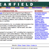
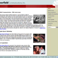
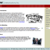
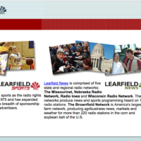
My little history project (Learfield and the Internet (1995-2005) took me to the Internet Archive Wayback Machine where I got a look at some of the websites I helped create and maintain during the early days of the Internet. The first sites we created were for our two news networks, Radio Iowa and The Missourinet, but we felt like we needed one for our corporate site and Learfield.com went up in 1997. It was designed and built by Dan Arnall and Allen Hammock. (The story is in the link above)
- 1997
- 1999
- 2000
- 2002
- 2003
- 2005
- 2006
- 2010
- 2011
- 2011
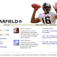
I’m pretty sure I’m responsible for the look of the page in 1999 and 2000. I had zero design training or skills and I also didn’t have a budget for those talents, so I took a whack at it. We did have some professional help eventually but today they all look, let’s just say, dated.
A “home page” on the Internet was a brand new thing in 1997. They became the public face of a company or organization and in those early days, little more than brochures. Everyone was trying to figure out how to make them useful. “Look and feel” was way more important than usability back then. We loaded our pages with text because space was not an issue. Or so we thought.
Images tended to be tiny because big ones too a long time to load on slow dial-up connections. As we added more and more pages to our sites, “navigation” became important. We gave our page links clever names that meant nothing to the people visiting our sites.
Looking at these are almost painful. Like looking at photos from your senior year in high school. Want more? Missourinet and Radio Iowa.






Interesting. Had not noticed that pattern.
1997 webpages
2007 twitter
2017 mastodon
every ten years there seems to be a reboot …