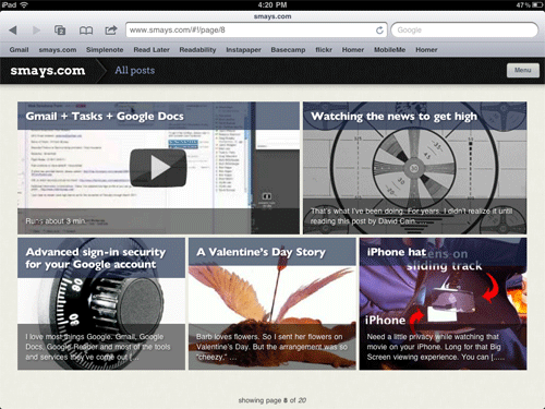
If –as I believe to be the case– most folks will do their web surfing on a tablet device (probably an iPad), I want to be ready. The minimalist theme (Thesis) I have on smays.com looks fine in a browser on the iPad but there’s more to it than that.
You just interact differently with the iPad: leaning back, swiping with your fingers, sharing on Facebook and Twitter… it’s a different experience and –for many– a better browsing/reading experience. Which brings me to Onswipe, a WordPress plug-in that optimizes your blog for a tablet. Think Flipboard.
I’ve only played with Onswipe for an hour or so but can already see a number of changes I’ll be making in coming days and weeks. The plug-in is new and still needs a few tweaks but I’m sure they’re on the way.
One thing Onswipe might do is breathe new life into older posts. The MENU button in the top right corner of the page pulls down to reveal the categories into which I’ve placed posts. If, for example, you were interested in what I might have posted regarding RADIO, it’s a little easier to find and browse with Onswipe.
If you’re reading this on an iPad, you’re feedback will be most appreciated.


I found your site when doin a search for OnSwipe to see what others are saying. I’ve installed it as well, and I do like it, but I think my blogs need more pictures to get mor oomph. Yours comes out better in my opinion. I quite lke it, would love a few more features in a new release, woule likely be will in to pay for some of them.
Additionally, like your site in general, as I’m a tech lover. Subscribe to your rss, good luck and keep posting!
Steve, it seems intuitive on the iPad. I was surprised to see iOS-like buttons on the blog page, but on the other hand, I knew what to expect. Back navigation is easy. Animated page flips make it clear what a page move means, as opposed to a drill into an article.