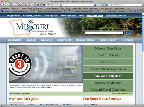
I recently learned of an ambitious undertaking involving the websites of some of the divisions of state government here in Missouri. The objective is to bring some consistency of design and how the information is organized.
 For example, why not put the search box in the same place on each site? Or, when deciding on names for different kinds of content areas, use the name most common to the public, rather than some acronym known only to those within the division or agency.
The man responsible for overseeing this sisyphean task is Tim Robyn, Deputy for Web Presence with the state’s IT services division. We had a cup of Rocket Fuel here at the Coffee Zone yesterday and he talked about the program.
The state of Missouri has dozens of websites but ten have been selected for this UI make-over. I forgot to ask Tim which ten but when I have that list, I’ll grab some screenshots so we can see a before-and-after.
PS: Tim has what might be the coolest title I’ve heard in a while.
UPDATE: The official State of Missouri site (below) and the MO Dept. of Agriculture were among the first to get the make-over’s. The Dept. of Insurance is up next, and offers a good “before” example. On deck: Revenue, Office of Administration, Economic Development, Labor and Industrial Relations, Mental Health, Natural Resources, Health, Social Services
I could be wrong, but the design below sure looks like a WordPress them to me.

